The living room is a place for gathering and entertainment. Whether you frequently have guests over or love spending time with your family, the living room is a spot in the house for getting together. It needs to be comfortable at the same time lively to create an ambiance for pleasant moments with the people you love. It is important for the room to have a positive vibe which can be achieved by using Vastu approved home colours ideas:
Vastu living room colour #1: Green for rejuvenation
Green is a soothing colour since it is associated with the natural world. In Vastu, green also represents growth and healing. If you prefer dark colours, hunter green or emerald green is perfect. If your choice is light colours, you can try sage green or mint green. You can infuse a hint of green in the living room with an accent wall, decor or plants. Brown furniture and beige decor pieces complement green perfectly.
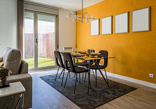
Vastu living room colour #2: Yellow for optimism

Yellow is a colour that brightens up the space almost instantly and perks up moods. In Vastu, yellow represents optimism and wealth. When used in moderation, in accent walls, false ceilings or painted over trimmings, this bright colour will infuse the space with a positive vibe.
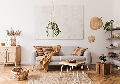
Vastu living room colour #3: Beige for relaxation
Beige is associated with clarity and calmness, creating a perfect ambiance for a conversation with a loved one. It is easy to blend beige into any existing colour palette and any decor style by switching out the curtains, rugs or throw pillows. If you’re on the lookout for home colour combinations, beige pairs well with all colours on this list!
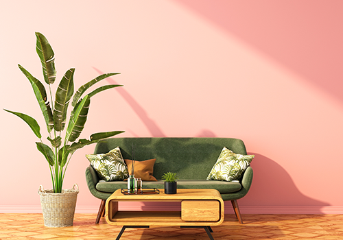
Vastu living room colour #4: Light pink for warmth

According to the principles of Vastu, light pink fosters warmth and a feeling of oneness. It is a perfect tone to channel a pleasant atmosphere in the living room and enjoy thoughtful conversations with family and guests.
Before choosing these colours, consider the direction of the room, the amount of sunlight it gets and what furniture it already has. This will help you choose the colour palette that is right for you. We recommend using these colours as a primary colour and combine with contrasting hues in small doses.