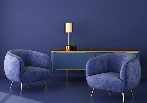
Colours have a remarkable ability to influence one’s mood or behaviour. When Pantone released its official colour of the year 2020, Classic Blue- the world of fashion, food, beauty and home decor quickly deciphered ways to incorporate this colour in their products. But little did we know, the intend of choosing this classic hue was a gradual return to everything traditional and simple.
Classic Blue encourages us to look beyond the obvious, to pause and reflect, challenging us to think more deeply, to connect with people and things around us in a more raw and natural way.
As we enter the half-way mark to the year, we can’t help but embrace the idea of everything traditional and simple. This lockdown has forced us to be mindful and take a break from our chaotic, jam-packed lives. After years of earning a living, working a 9 to 5 job, looking after our families, being in rush constantly, Friday highs and Monday lows, this time of quarantine is actually a gift. And a reflective Classic Blue tone that fosters resilience and perception can help build a stable foundation for our homes.
For home interiors and design, Classic Blue can bring a sense of serenity and peace, offering refuge. And during an uncertain time where we are forced to be cooped up inside our homes for an indefinite time, incorporating this hue into our homes can reap many benefits. You can paint an accent wall in the colour, get inspired by Berger Paints Colour Catalogue or switch up the kitchen cabinets. If you have moved to work from home during this time, adding this colour to your home office or working space can help create a relaxing yet productive atmosphere. If you’re not ready to commit in a grand way, start small. Add textiles, prints or fresh flowers like hydrangeas or Blue Lotus. This colour can work great in the bedroom too since it is suitable for creating a composed atmosphere wherein you can feel at peace and rest.
Classic Blue is a colour that is not quite navy, far from the sky blue, it is blue that is dark, deep and has an almost earthy undertone. Pantone describes the colour as non-aggressive, easily relatable and a solid and dependable shade meant to provide refuge. The institute chose the colour in response to the frenzy and anxiety most of us live with today.