In search of the biggest interior wall colour trends of 2022? Discover the top predictions from our colour experts.
Colours mean different things to different people. During the chaos of the Covid-19 pandemic, some gravitated towards soothing neutrals whereas others surrounded themselves with bright, cheerful colours. Now, as we begin to imagine the post-pandemic world, different colour trends are predicted to rule the colour charts in 2022.
Colour trend forecasters have predicted bright hues that give a jolt of energy during the bleakness of the times we live in will be a major trend in the coming years. At the same time, hues inspired by the great outdoors will continue to dominate the interior paint colour charts.
Here are some wall colour trends you need to watch out for in 2022:
#1 Rethink Colour Combinations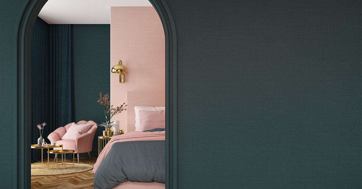
Move over neutrals. Mismatch colour combinations that fall on the opposite sides of the colour wheel are a great way to pack quite the style punch. Be it blush and olive, green and black or coral and aqua- there are plenty of colour combinations for homes of every style.
Berger Colour Catalogue Recommendation:
Blush and Olive: Tu Tu (1P0004) and Trivagos (4T2172)
Green and Black: Sparkle Green (4T2175) and Midnight Rush (8A2806)
Coral and Aqua: Beach Bum (2T0589) and Country Bay (5D1071)
#2 Incorporate Grounding Colour Schemes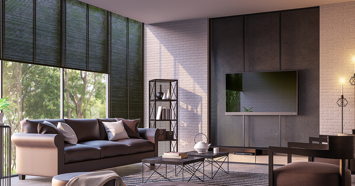
There is plenty of debate on how to define neutral colours. Most people tend to think that ivory, khaki, grey and beige are not counted as neutral. However, in general, neutral room colours are calming and easy to use. They work well with almost every colour.
Pairing contrasting black or deep grey with white is an effective way to create impact in a predominantly white room, but the key is to vary the proportions.
Berger Colour Catalogue Recommendation: Fawn Taupe (7T0342), Venetian (8T1692)
#3 Add Warmth With Deep Browns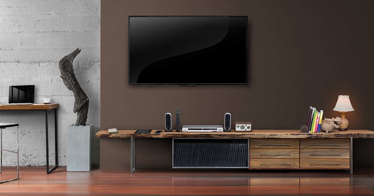
A rich palette of tan browns, caramel and warm taupe is stated to influence interior trends for 2022. Deep browns are warm and versatile. It can help create an inviting, warming feel in dark rooms and strike a refined note with rooms that receive plenty of natural light.
This colour favours hues inspired by nature like blue and green but a burst of bold, bright colour can also give it a stunning contrast.
Berger Colour Catalogue Recommendation: Cinnamon Sprinkle (7T0339), Unpolished Rice (7T2467)
#4 Pair Terracotta With Mint For A Harmonious Colour Scheme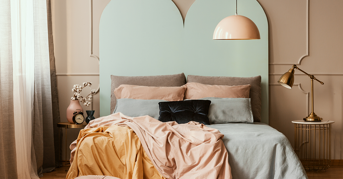
It’s hardly a secret that earthy tones are in right now and it does not get more earthier than terracotta and mint. In spite of being on the opposite ends of the colour wheel, they work perfectly together, terracotta adding warmth whereas mint adding coolness to the space.
Berger Colour Catalogue Recommendation: Aged Pottery (7D1615), Elemint (4P0093)
#5 Don’t Be Afraid To Make Bold Choices
Be it in life or home decor, bold choices can be extremely rewarding. A great way to use bold colours without overwhelming the space is to add it in smaller doses or accents.
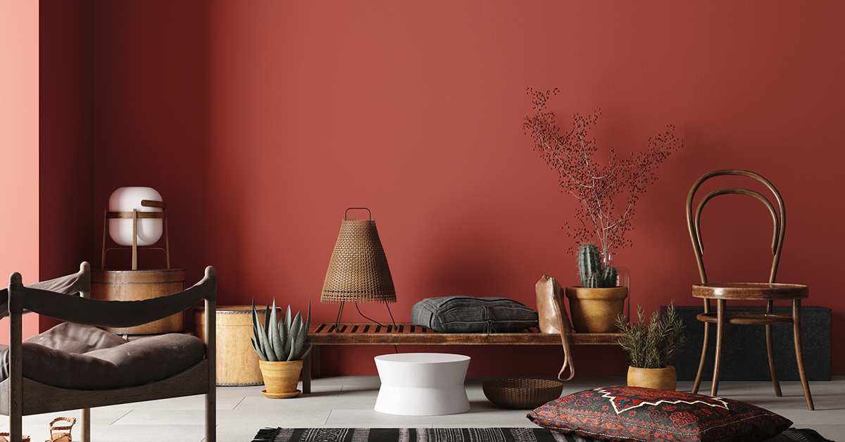
A colour we love right now and is sure to make a comeback this year is rust or terracotta red. It is bright but the clean notes make it feel timeless and vintage, a great bold colour choice for walls and furniture alike.
Berger Colour Catalogue Recommendation: Sweet Craving (2T2063), Hello There (1T1988)
#6 Add Dimension With Grey And Blue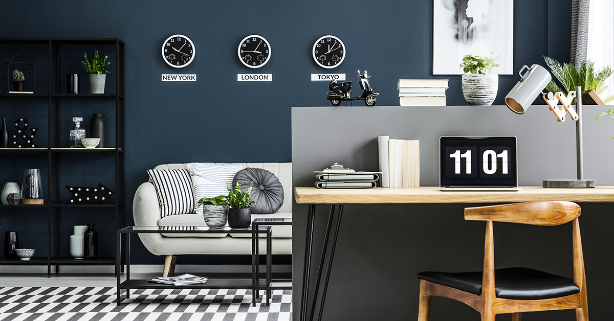
Sleek, stylish and sensible, this colour palette is perfect for people who refuse to be boring! Whether you pair light blue and charcoal grey or navy and powder grey, the result is effortless elegance.
Berger Colour Catalogue Recommendation: Winter Grey (8T2709), Tranquil Teresa (5P1154)
#7 Black Is The New Black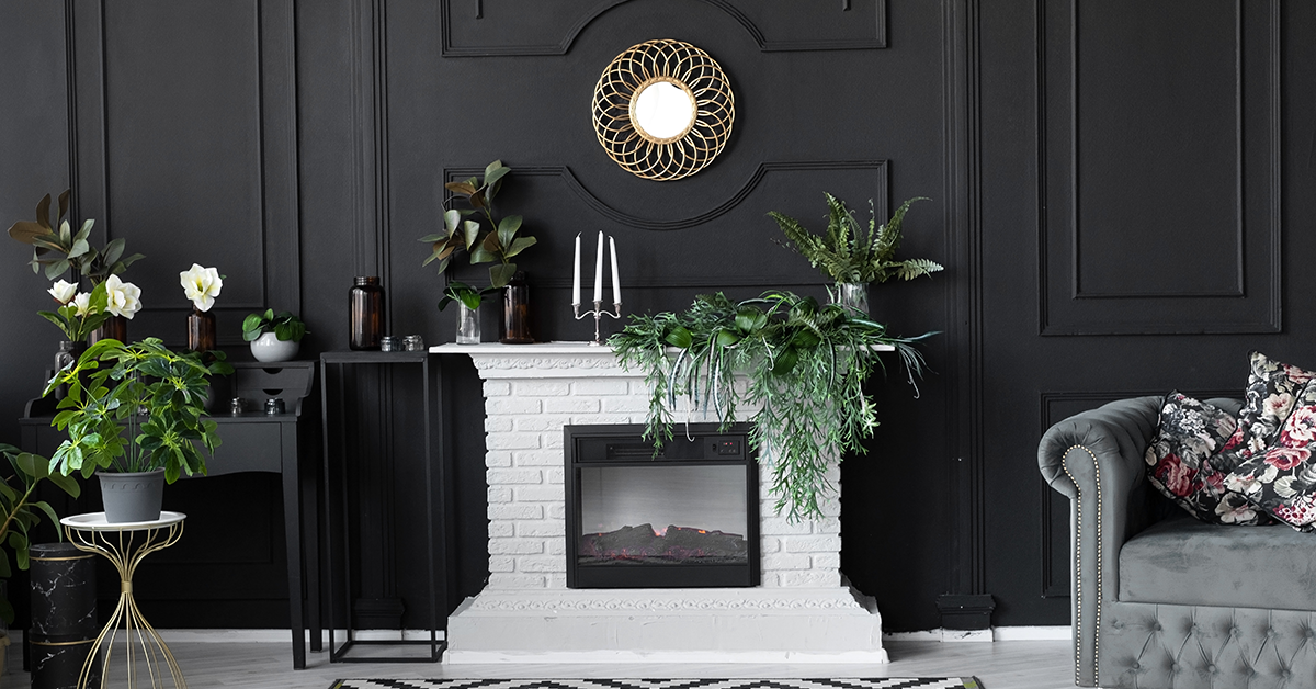
If you are looking to make a big statement, black is the way to go! If your space gets enough natural light, it can help create a truly fantastic look. Interior designers love going black as an option for paint for interior walls because it can make a big statement without spending big.
You can choose to play it safe with black decor or a statement piece of furniture or go bold with black walls!
Your interiors will not be gloomy if you pair black with pops of colour in your furnishings or accessories. A moody space can be inviting and cosy. Black walls can fit into any room, be it industrial, modern, Scandinavian or anything in between.
Berger Colour Catalogue Recommendation: Night Time Magic (8A1808), Tuxedo Tail (8A2693)
#8 Paint With Dusty Pink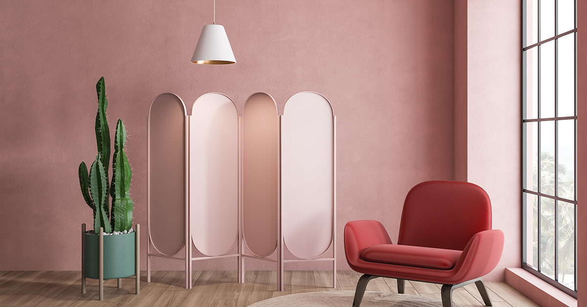
Dusty pink room ideas are the new neutral– they have the ability to bring warmth and interest to the space without overwhelming it with colour. But choosing just the right shade of pink can be a difficult task. The key is to pick a more serene and pleasing hue, a quietly confident colour that creates a perfect backdrop. As seen in the living room above, it is versatile enough to complement most colours in the room, be it the green cactus or terracotta-red toned easy chair.
Berger Colour Catalogue Recommendation: Cranberry Mist (6T1435), Misty Mauve (6T1427)
#9 Revel In Soft Lilacs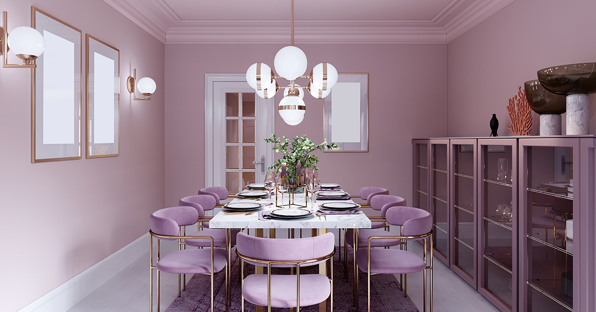
Softer tones of purple have made a major comeback in the world of interior design in recent years and it shows no signs of slowing down. As a matter of fact, Pantone recently announced a very peculiar Very Peri is the Colour of the Year 2022.
Soft lilacs straddle the line between floral femininity and rich elegance. This makes it fitting for people who want to achieve a more luxury or exclusive feel in their home. In a more muted avatar, a soft lilac is a surprisingly liveable shade even when used on all four walls.
Berger Colour Catalogue Recommendation: Violet Rays (6P2326), Obsession (6P0159)
#10 Reimagine Vintage Yellows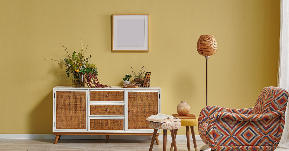
Yellow is a shade of optimism and joy. So after the global chaos of the past year, it hardly comes as a surprise that it makes it to the top 10 list of trending colours. The new yellow in hues of lemon and mustard tones can add richness to more traditional schemes. The key is to look out for nature-inspired hues that are grounding and calming but also simple and cheerful.
Berger Colour Catalogue Recommendation: Soul Sensation (3P1870), Starched Linen (3P0060)
Final Thoughts
The colour trends for 2022 signal a sense of optimism and hope for the future, as well as a move towards incorporating elements of well-being into the home. We hope that in the coming year, you surround yourself with positive, vivid colours, reaching for optimism and light.
If you’re feeling inspired with our top colour ideas, we suggest you consult our Express Painting experts today! SMS ‘XP’ to 56767 or call now on our toll-free number – 1800 103 6030.

 Get in Touch
All the colors are wonderful!
Hello Purendran. Thank you for sharing your thoughts with us. To explore the colours mentioned in this blog, you can check out this link: https://www.bergerpaints.com/utility-tools/colour-catalogue/
If you feel inspired, you can contact our professionals at Berger Express Painting service. SMS ‘XP’ to 56767 or call on our toll-free number – 1800 103 6030.