Colours, Architecture & Emotions
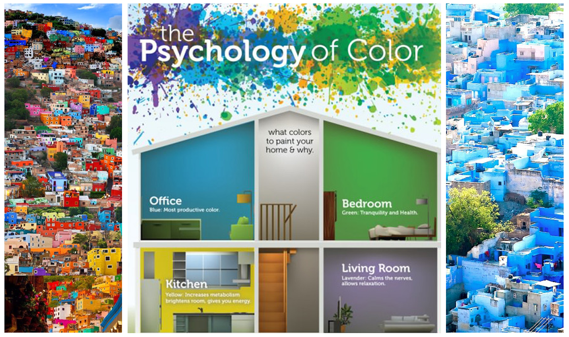
Frank Mhanke rightly observes that over the last century, several scientific studies, empirical observations and research have proven that the human experience of architectural environment is to a large extent based on our sensory perception of colour. These studies confirm that the human response to colour is total – it influences us psychologically and physiologically.
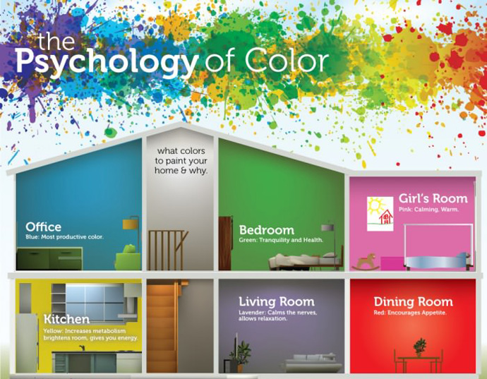
The association of colours with moods and connotations is consistent cross-culturally from one individual to another and group to group – colour is an international visual language understood by all! This is one major reason why architects have explored the potential of colour and the mood it engenders by integrating it into built spaces. Broadly, the direct impact of some basic colours is understood as following:
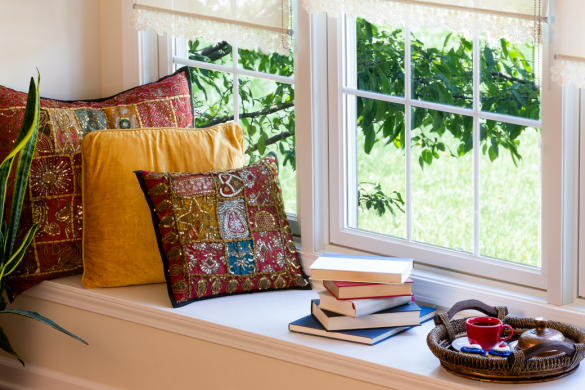
Pastel yellow gives the impression of sunny, friendly, soft. The message in the interior space is stimulating, brightness, coziness.
Red is arousing, passionate, provocative, fiery, aggressive. The message in the interior is aggressive, advancing, dominant.
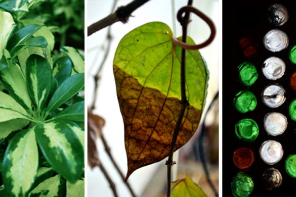
Green is balancing, natural, calm with the message of simplicity, security, balance.
White expresses open, vast, neutral and sterile. The message being purity, emptiness, indecisiveness
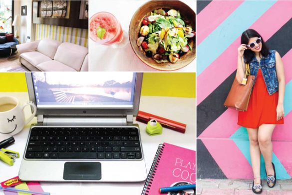
A diagram made by Diksha Jiandani illustrates: When colour is complimented with specific spatial and geometric forms its collective cognitive and emotional impact gets heightened creating a deeper and richer experience for the user.
The Historical Perspective
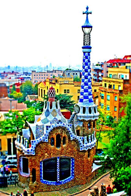
The use of colour in architecture has been effectively applied since the early ages in both Indian as well as European, Middle Eastern and Chinese cultures. In Italy, during the Baroque era, architecture was assigned the role of conveying emotions and captivating the imagination of the masses visiting churches. Colour played a pivotal role in fulfilling this architectural ambition. Following that trajectory of radical use of colour and blending it with his curvilinear fluid forms was the master architect Antonio Gaudi. During the time, he was perhaps the most radical in his experimentation of colour and architectural form and showcasing to the world the magic that could happen when the two combined.
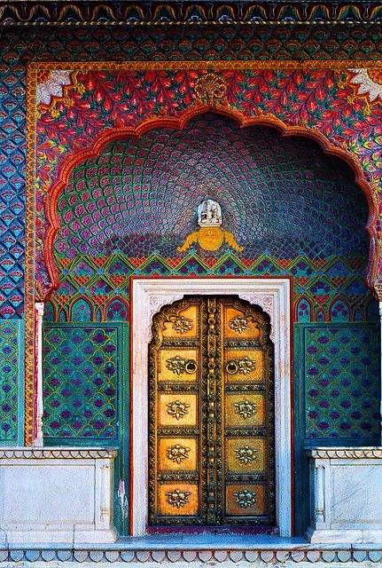
In India, the use of colour is perhaps the most artistic and vibrant. From an early era, colour was applied as a visual art, not just in the interiors but for the exteriors of a building as well. The use of colours was eclectic yet vibrant and appealed precisely to the very basic of human emotions. Not just the application but the production of colours in India has a rich cultural trajectory with the use of natural stones and plant dyes that are still prevalent today through the craftsmanship of ‘Meenakari’ art in Rajasthan.
Colours in Urbanism – From the Formal to the Informal
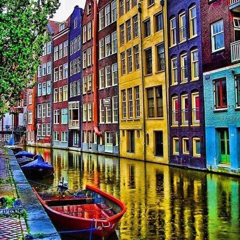
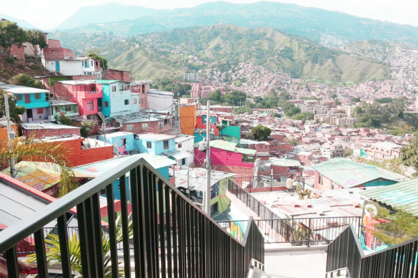
The use of colour on an urban scale has two very different evolutions. One comes as a natural and informal development of towns into cities and cities into neighbourhoods. This type of informal settlements often displayed a rubric of eclectic colours which were primarily a result of random application. The effect was a vibrant and lively urbanscape. Taking a cue from this evolution emerged a rather carefully crafted approach of formal urbanism that intended to ultimately create a similar effect of random eclectic and vibrant urban typology via imitation. The latter is prevalent predominantly in the post-war regions of Europe and late 20th century North America. India, however, is the mecca of colourful informal urbanism with the proliferation of colour and its celebration as a fabric of the masses.
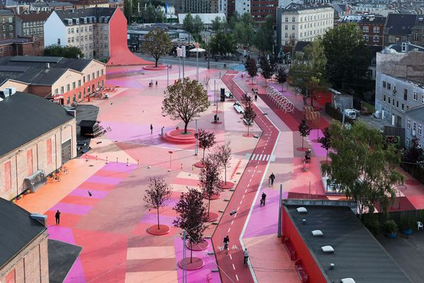
In a recent urban project in Denmark, the use of bright colours as an activator of public life was explored by its literal application along the streets, side-walks and buildings façades.
Colours in Today’s Built Environment
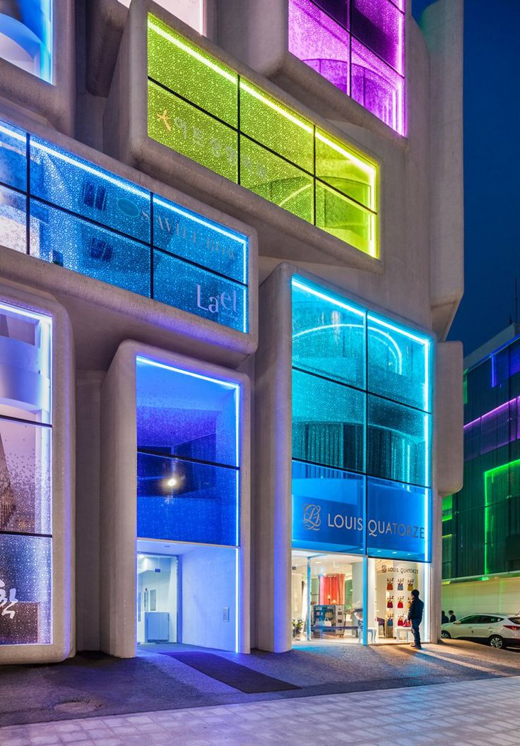
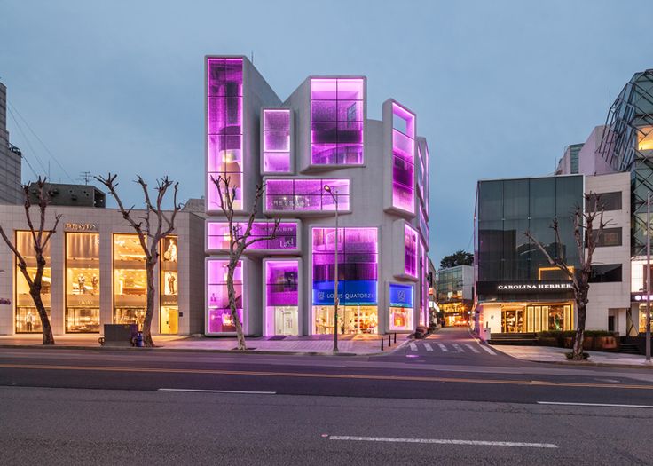
From its traditional application as a tool for interior décor, the use of colours has once again moved outwards to the exterior of the building as continuation of the internal experience. This phenomenon is not new to the Indian context, however, the role of technology and lighting has added a new dimension to it. The building’s “skin” has become a key element of evoking a response in the user and drawing them inside. The move has been further propagated by the potential impact that commercial enterprises can generate from customers – as a result, this phenomena is most common in commercial office buildings and shopping malls.
Towards a New Paradigm
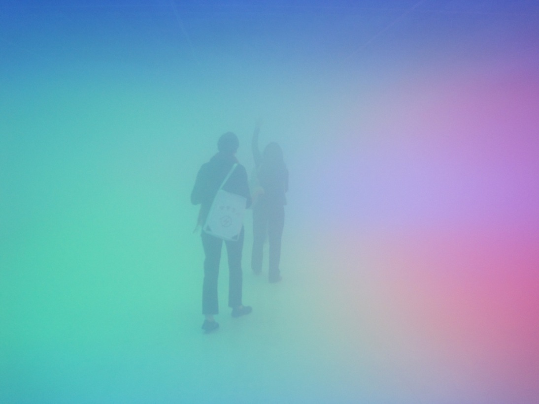
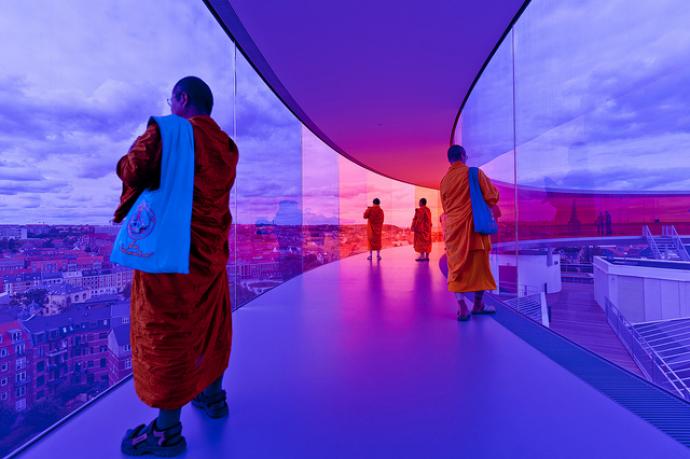
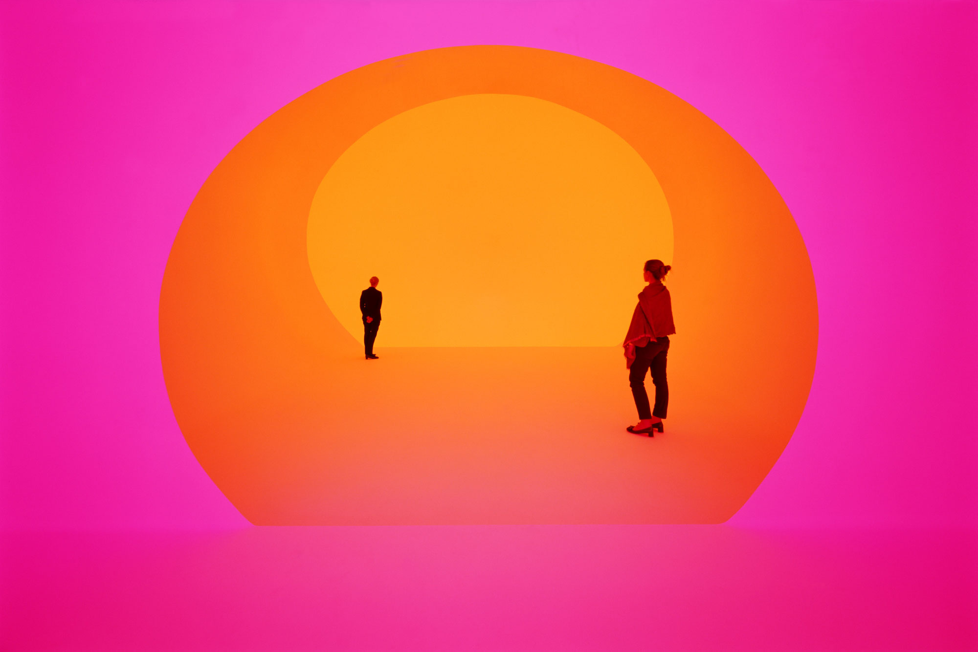
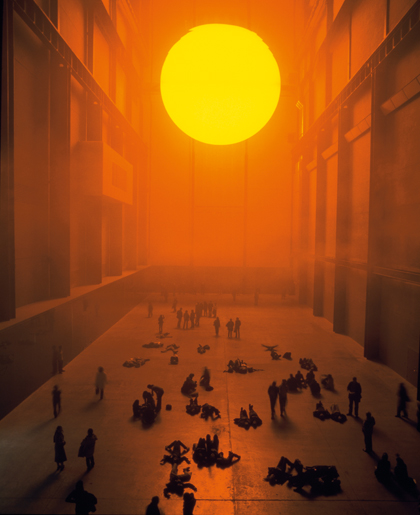
Contemporary architects and artists are now collaborating to completely change the way we experience colour from a pure visual interface to a total immersive 3-dimensional sensory experience. This development has been furthered by the role of technology in fabrication, lighting and advancement in materials research.
Sense of space, time and emotions are taken to the extreme in these immersive coloured environments. Artist Olafur Eliasson is well known for his use of colours in his installations to draw magical emotional response from viewers.
Such installations are limited but their impact is phenomenal – everything we thought we knew about colours and their impact on the human mind might soon change forever when we move beyond seeing colours to feeling them.
Text Credits
Psychology of Colour, Frank Mhanke article in Archinect, 2014
Photo Credits
Olaffur Elliason, Artist
James Turell, Artist
Herzon deMeuron, Architect
Bjarke Ingells Group, Architect
