People’s emotional responses to colour are governed by their personal experiences with that colour. My dad worked for the Tatas all his life and we lived in a Tata house. That meant that all walls were always white… period. No colour ever. So, in my formative years, that’s all I knew – all walls were white. It’s only much later when I started working that I realised the effect of colour in the workplace.
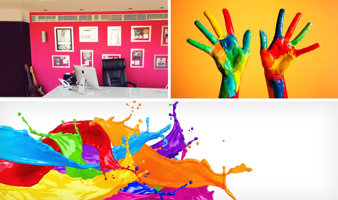
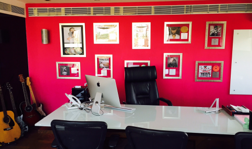
I was away on my annual leave a couple of years ago when my Marketing Director decided to paint the wall in my office with a colour that I would have normally never considered. He painted it a shocking pink! I slowly became aware of how the colour made me feel. It was as though I was in an atmosphere charged with action. This was a place where decisions were made and made with great fortitude. I have never felt a dull moment ever in this room. I felt like if I ever painted my wall white, I’d have half the energy I have now! The colour fuchsia, which has been eternally used to sell to female audiences, evokes the exact opposite reaction in me and I’ve always considered myself to be an alpha male!
My earliest memory of a complex colour (at age 4, I must have known only black, white, blue, red, yellow and green) was the colour, purple. My big secret was to secretly enter my kitchen, open the fridge and eat copious amounts of Kissan’s purple colour Mixed Fruit Jam. My mother would ask why the jam levels disappeared considerably ahead of schedule and I’d feign ignorance!
As I write this, I now realise that purple has become a big part of my colour palette. Even without making the link, I own purple socks, my luggage is purple, and a lot of my ties and pocket squares are purple. I am a ‘type A’ example of someone who is hardwired to certain hues, and purple to me means excitement because of my experiences with the colour while growing up.
Along these lines, different colours mean different things to individuals and therefore evoke different emotions.
Generalisations of Colour-Emotion Relationships can be Misleading
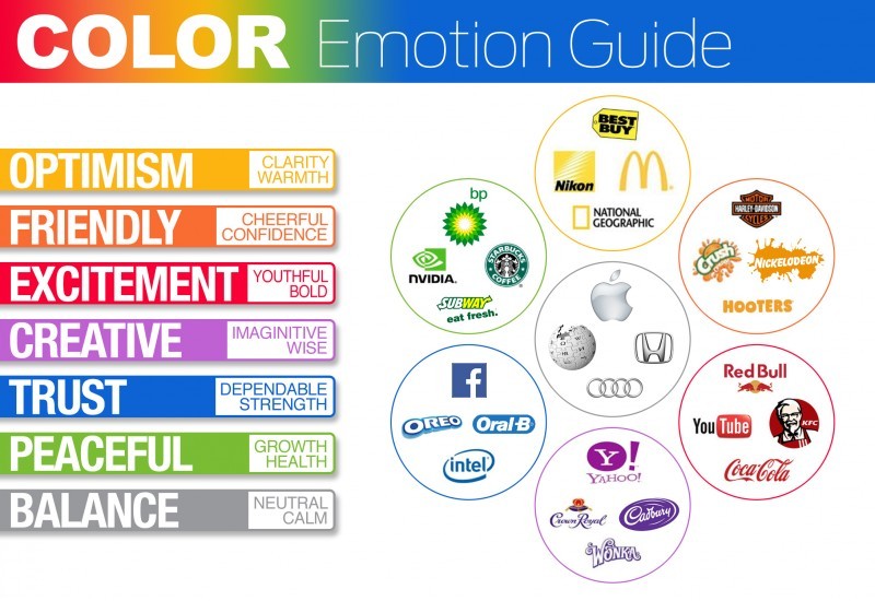
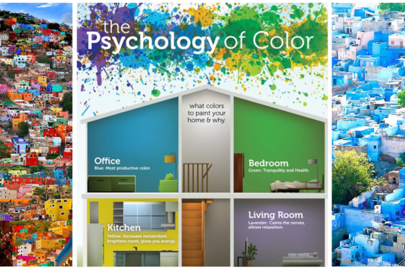
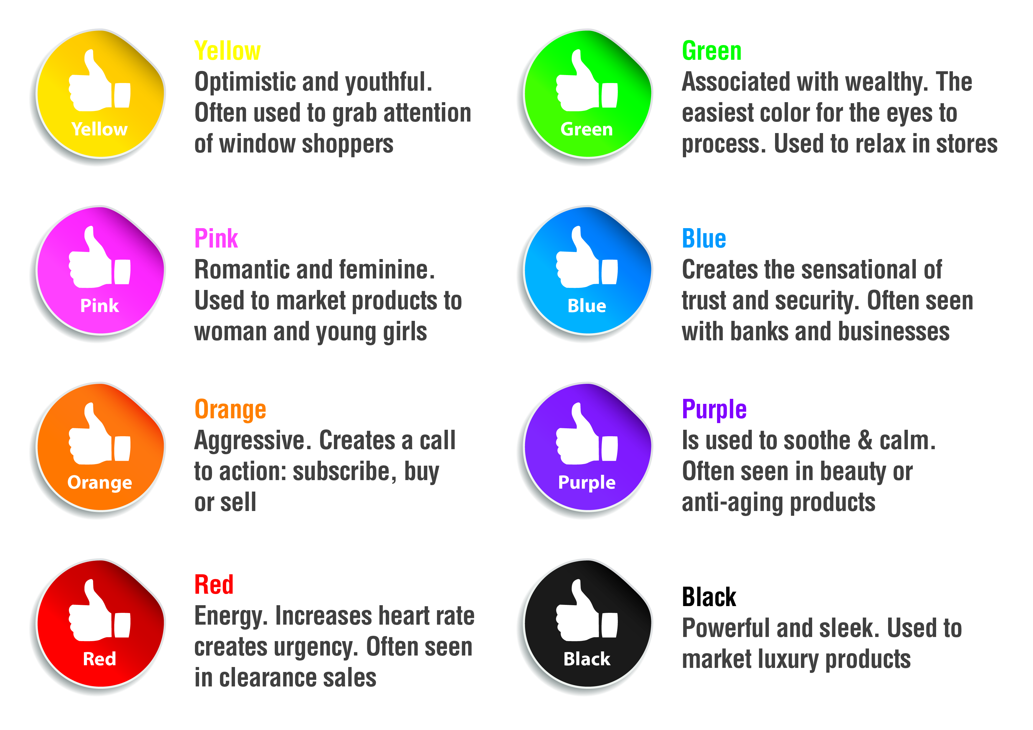
Today, there are numerous generalisations claiming to aid people’s decisions in colour choices for myriad uses. Generalisations of colours and people’s responses to them can be misleading. Numerous attempts as the one below are good examples of this. In my opinion, the responses different colours evoke in individuals cannot be generalised. Even though colour preferences are generalised across cultures, there are considerable differences amongst individuals. And as explained with the help of my personal experiences earlier, it is difficult to provide a generalised guide to the use of colour and emotion.
To underscore the point I’m trying to make, take a look at what purple is stereotypically associated with, as opposed to what it means to me:
Marketers attempt to grasp an understanding with deep research on this subject with the end goal of actually leading us into a world, where our ability to recall, and even lead to purchase decisions, are actually based on colour.
Tons of research by some of the leading experts in this space eventually led to the birth of some of the most prominent logos, proving that it’s more than just generalising colour-emotion relationships.
What research does show is that colour – in a broader sense – can have a considerable effect in branding and purchasing.
Here are some areas where concrete research has actually been done:
Fit Between Perceived Positioning and Colour
Choosing the appropriate colour for a brand logo can result in creating immediate value for the brand. When the brand is trying to position itself, people associate colours with this positioning. Whether this has a positive or negative impact depends on the fit between perceived positioning of the brand and colour associated with this positioning.
Colours can Influence Purchasing Intent
Since colours have an impact on consumer perceptions of the brand, we can also draw links, confirmed in studies, to its effect on purchasing intent. Colours augment the personality marketers wish to create for the brand, which, in turn leads to purchasing intent. Think of how the colours used by your favourite brand influence your perception of its personality and therefore your purchasing intent.
Our Brains Pivot to the Brands that are Easily Recognisable
It is important that the colours considered at the time of creating an identity for the brand is one that can be recalled and recognised easily. Think of blue and which brand comes to mind immediately?

Facebook’s brand identity is associated with the colour blue. Studies have also shown that new brands have shown higher success rates when the colours used ensure differentiation from competitors. The choice of colour would then have to be one that is simply different than competitors.
Connecting the Dots and Finding the Fit
Putting it all together, we come to understand that brands with the honed ability in predicting consumer perception of their brand personality and then choosing a colour that fits this personality, as opposed to picking a colour because of the stereotypical emotion you are trying to evoke will have a stronger chance of becoming a recognisable brand that is associated with the chosen colour. In this case, the colour chosen will have a positive impact in building the brand.
If you are a newer brand, and are in the process of creating your brand identity, you should be able to best guess the perception you will evoke in your consumers and then align your brand colour to that for the best results.
Colour and Its Meaning to You Can Evolve
Having said all that, I am also the biggest contrarian to my own logic. If you asked me what my favourite colour was, I’d have to say black. Every car I’ve ever owned was black, my favourite clothes are black. I gravitate towards black quite subconsciously. In contrast, I was never a fan of black growing up because of its association with darkness. Today, my love for black is ever growing and could be attributed to my love for heavy metal music.
So your personal emotions related to colour are actually ever evolving. Which is why this topic has been such a fun one to write about. Different individuals react differently to different colours. What they emote today with a colour may not be what they emote next week or next year. Consequently, this could have implications on brand colours as well.
Take a look at how the Hindustan Unilever logo colour has evolved:

To conclude, there is no clear-cut guide to which colours evoke specific emotions because of people’s varying experiences with these colours. This is an open debate and one that will be as relevant in the years to follow but of one thing I am certain of – Colours will continue to be a huge factor with brands and marketers.
Rights to images used remain with respective photographers /owners.
